Showing posts sorted by relevance for query color. Sort by date Show all posts
Showing posts sorted by relevance for query color. Sort by date Show all posts
Wednesday, February 6, 2013
Close Enough Doesn't Cut It: Differences in Color
Color
| In this guest post, author Daniel Harris examines the fine techniques of color matching that are used in nearly every product manufactured today. With plastic parts and metal parts requiring seamless design integration in final assembly, color matching is essential to industrial design and manufacturing. |
But when it comes to production even the smallest mistake can potentially cost millions of dollars. Mistakes with color can easily happen, especially if parts are being manufactured in different plants. Everyone perceives color differently based on mood, age, health, and a host of other factors. When it comes to production, here are some of the biggest factors when it comes to choosing and matching color.
• Light Source: Light changes the most underneath different lighting which is too be expected since color is simply a reflection and absorption of light waves. Different lighting has different spectrums and materials will latterly reflect the changes by being a different color. Imagine you’re designing a sports jersey for a large college or professional football team. The fabric looks great in your studio, but underneath the halogen lights something is off. Products need be tested underneath an agreed upon light source for consistent results.
• Different Materials: Car manufacturers deal with this all the time. The soft grey on the hard plastic dash needs to be the same soft grey as the plush faux leather seats, but the two materials reflect light differently. This means a different solution is needed for each material to get the same result.
• Different Surfaces: Even though you may have the same material, the material can have different surface textures and finishes. A rough texture will not look as bright as a smooth texture just like gloss will appear much brighter than matte.
Labels:
color,
color matching,
design,
industrial design,
manufacturing
Thursday, April 11, 2013
Timothy Samara's Design Elements Is Accessible and Informative
Books
| Timothy Samara's book, Design Elements: A Graphic Style Manual, available in print and on Kindle is simply the most compact and lucid handbook available outlining the basic design principles of layout, typography, color usage, and space. |
imothy Samara's book, Design Elements: A Graphic Style Manual , available in print and on Kindle is simply the most compact and lucid handbook available outlining the basic design principles of layout, typography, color usage, and space.
Being a creative designer is often about coming up with unique design solutions. Unfortunately, when the basic rules of design are ignored in an effort to be distinctive, design becomes useless. In language, a departure from the rules is only appreciated as great literature if recognition of the rules underlies the text.
Graphic design is a “visual language,” and brilliance is recognized in designers whose work seems to break all the rules, yet communicates its messages clearly.
Tuesday, January 29, 2013
Jessica Rosenkrantz Experiments With 3D Printing In Color
| Designer Jessica Rosenkrantz of the firm Nervous System has been busy experimenting with full color 3D printing. The 'Colony' prints are perhaps inspired by underwater creatures and their vivid colors. |
Now designer Jessica Rosenkrantz has been busy experimenting with full color 3D printing. Nervous System was founded in 2007 by Rosenkrantz and Jesse Louis-Rosenberg. Jessica currently acts as Creative Director and Jesse as Chief Science Officer. Together they lead a team of seven.
Nervous System's designers create using a novel process that employs computer simulation to generate designs and digital fabrication to realize products. Drawing inspiration from natural phenomena, they write computer programs based on processes and patterns found in nature and use those programs to create unique and affordable art, jewelry, and housewares.
Each print in the new collection is 4 to 6 inches, the meshes are generated by the Processing computer language and 3D printed by Shapeways.
Rosenkrantz must have been inspired by her coral-filled fish tank because these gorgeous "Colony" prints remind one of diving in the Caribbean.
Labels:
3d printing,
art,
color,
design,
jessica rosenkrantz,
Nervous System,
processing,
shapeways
Tuesday, March 19, 2013
Casey Reas - How To Draw With Code
| Artist Casey Reas uses software code to express his thoughts—starting with a sketch, composing it in code, and witnessing the imagery that it ultimately creates. Using the software he helped to create, Reas uses color to convey emotion and movement. |
In the video above, Reas is at work his studio where he uses color to convey emotion with his programming language Processing. —
Together with Ben Fry, he created the software while at MIT, and it is now used by thousands of artists and designers worldwide.
A former student of John Maeda, Reas is an artist whose conceptual and minimal works explore ideas through the contemporary lens of software. Reas’s software and images derive from short text instructions explaining processes that define networks.
Reas attributes his involvement in the creation of the programming language Processing to Maeda’s book, Design by Numbers
Thursday, January 24, 2013
Matthew Cusick Maps Out His Images
Matthew Cusick
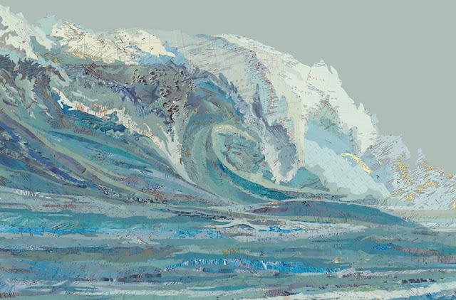
| Matt Cusick's extraordinary collages use maps to form the geometry and color palette of his work, with the elevation maps and other cartographic images blending into his images. |
In developing these collage pieces, Cusick slices segments of maps found in old textbooks, encyclopedias, and atlases and then forms the elements together into his compositions.
Most of Cusick's collages use the maps own colors to inform his palette, with the elevation maps and other cartographic images blending into his images.
From a distance, the collages almost look like vector based computer illustration, but viewing the pieces closer and over time reveals the subtlety of their construction.
Cusick explained how he got started using maps to More Magnificent Metropolis:
Frustrated with paint and brushes, I just started experimenting with some maps I had laying around the studio. I found that maps have all the properties of a brushstroke: nuance, density, line, movement, and color. Their palette is deliberate and symbolic, acting as a cognitive mechanism to help us internalize the external. And furthermore, since each map fragment is an index of a specific place and time, I could combine fragments from different maps and construct geographical timelines within my paintings.
Maps provided so much potential, so many layers. I put away my brushes and decided to see where the maps would take me. I think collage is a medium perfectly suited to the complexities of our time. It speaks to a society that is over-saturated with disparate visual information. It attempts to put order to the clutter and to make something permanent from the waste of the temporary. A collage is also a time capsule; it preserves the ephemera of the past. It reconstitutes things that have been discarded. A collage must rely on a kind of alchemy; it must combine ordinary elements into something extraordinary.
Cusick's provocative work below, Malvo features map locations and target imagery that made up part of the sniper's area of operation.
Malvo, 2011
Maps, sighting targets, ink, dye, on panel
40 x 30 inches
Labels:
art,
collage,
color,
Matt Cusick,
painting
Saturday, February 2, 2013
Paperman Blends Hand Drawn Animation With CGI Brilliantly
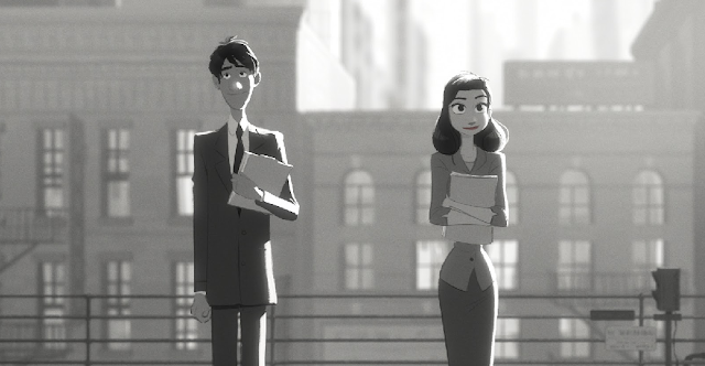
| Paperman is a 2012 black-and-white animated short film produced by Walt Disney Animation Studios and directed by John Kahrs. The short blends traditional animation and computer animation and is now available online. |
Paperman is different from many recent cartoons, not just because of the limited color palette and retro styling of the characters and the world they live in, but because it doesn’t look like the generic, quasi-photo-realistic CGI that is becoming more and more common. Paperman actually looks as if real people have created it, not machines, and that’s something we haven’t really seen in feature animation for years.
That’s intentional, according to the man behind the short. Director John Kahrs told Cartoon Brew that the origin of Paperman “really came out of working so much with Glen [Keane] on Tangled.” After looking at the work of Keane — a classic Disney animator who worked on The Little Mermaid, Beauty and The Beast and Aladdin, among many other projects – Kahrs found himself with a new appreciation for traditional animation and drawing techniques. “I thought, Why do we have to leave these drawings behind? Why can’t we bring them back up to the front of the image again? Is there a way that CG can kinda carry along the hand drawn line in a way that we haven’t done before?”
Paperman‘s seemingly seamless way of blending the personality of hand-drawn animation with CGI in the physical space of the story is the result of new in-house software called Meander, a vector-based drawing program that allows for manipulation of the line after the fact — something that Kahrs described as “just like painting on the surface of the CG.”
Labels:
academy awards,
anmiation,
digital art,
disney,
film,
illustration,
Meander,
paperman
Wednesday, January 23, 2013
Black Bunny Pillow From kozyndan
For the Home
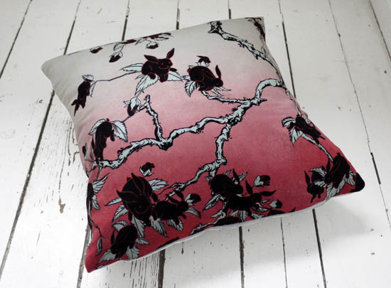
| Artists kozyndan's Black Bunnies pillow represents the great results that chance and error can sometimes bring to art and design. |
kozyndan have released several cushions with them in the past and we have to say, they make a great product. The cushions are so soft and the print quality is very fine.
As the artists prepared to create the silk screen edition of our "Bunny Blossom" earlier this year, their printer showed a misprinted version of the print as a color proofing. In it he had printed the bunnies black instead of white. "We thought the image rather striking, but it was just a one off misprint and never recreated… until now for this cushion."
 The cushion is now available from Click For Art.
SOURCE kozyndan
| By 33rd Square | Subscribe to 33rd Square |
Labels:
art,
Black Bunnies,
design,
illustration,
kozyndan,
pillow
Tuesday, April 16, 2013
Fonts & Colors That Drive the World’s Top Brands
Graphic Design
| Tasty Placement's infographic provides some good food for thought if you’ve hit a roadblock on your latest logo design. |
Their infographic provides some good food for thought if you’ve hit a roadblock on your latest logo design.
The team found that most brands opt for a blue logo featuring the world’s most popular sans-serif font, Helvetica. Serif fonts ended up being the least used typeface, although it hasn’t stopped Google from being listed as the #5 top brand in the world.
SOURCE Tasty Placement
| By kree8tiv | Subscribe to kree8tiv |
Labels:
branding,
design,
graphic design,
Infographic,
logo design,
Tasty Placement
Thursday, February 28, 2013
Modernizing The Visual Echo
Film
| The film "Choros" directed by Michael Langan and Terah Maher modernizes the visual echo technique developed for scientific study in the 1880's pioneered by Eadweard Muybridge. |
In the late nineteenth century, a photographic technique called "chronophotography" began to develop, whereby multiple photographs would be taken in rapid succession to study the movement of a given subject.
Eadweard Muybridge famously filmed a horse in motion in 1878, providing the world with its first taste of motion pictures when the images were displayed on a spinning zoetrope.
Several years later, the French physicist Etienne-Jules Marey developed a stunning variation of this technique when he captured multiple poses of a subject over time onto a single frame of film, rendering a kind of visual echo.
Labels:
choros,
dance,
Eadweard Muybridge,
film,
Michael Langan,
Terah Maher
Sunday, January 27, 2013
Scott Robertson Takes Transportation Design To Extremes
| Continuing from his boyhood obsession with soap-box racers, Scott Robertson has for years instructed artists and designers the 'drawthrough' method and continues to work in the transporation and entertainment industries developing exciting concept art and design. |
After two and a half years at Oregon State University, Scott transferred to Art Center College of Design in Pasadena in 1986, California where his father had studied illustration.
Robertson graduated in 1990 with honors and a B.S. in Transportation Design. He then opened a consulting firm in San Francisco, where he designed a variety of consumer products, the majority being durable medical goods and sporting goods. In 1995, he began teaching at Art Center, first with a year-and-a-half stint at Art Center Europe in Vevey, Switzerland (now closed), and then in Pasadena, California.
|
| |


